
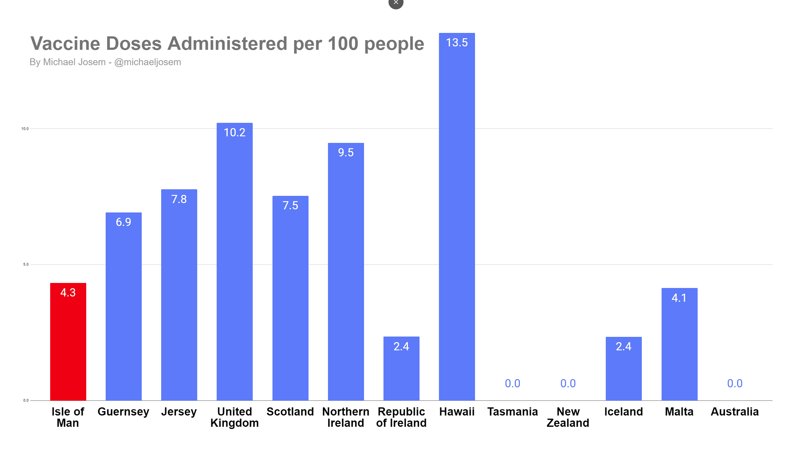
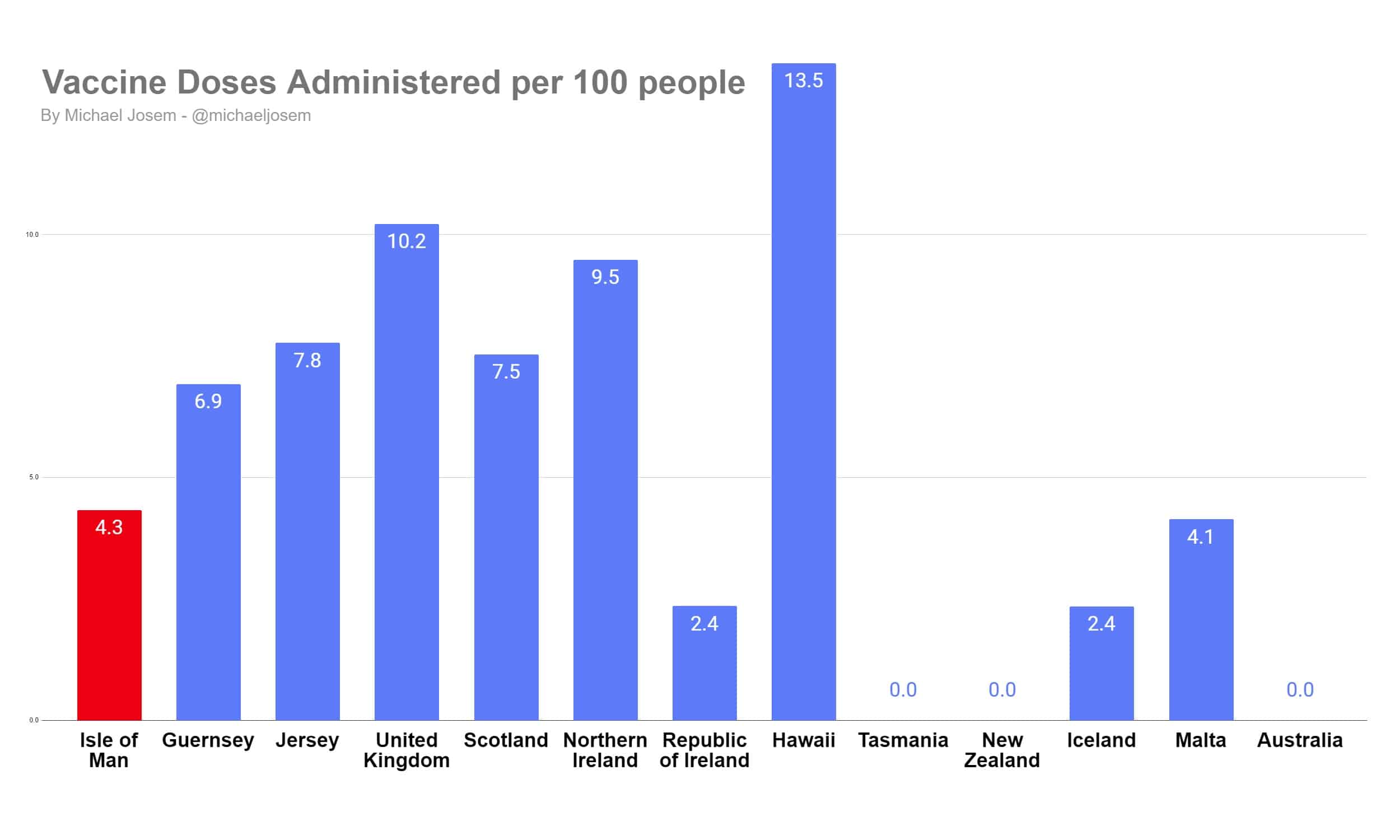
The Isle of Man has administered a lot less doses of coronavirus vaccines per capita than the United Kingdom, the Crown Dependencies, or Hawai’i. The Isle of Man has administered more vaccine doses than the EU nations of Malta, Iceland and Ireland. Australia and New Zealand have not administered any doses yet.
The Isle of Man has administered 4.3 doses per 100 people. Hawai’i is leading with 13.5 doses administered, with the United Kingdom administering 10.2 doses overall. The Crown Dependencies trail, with 7.8 doses per 100 people administered in Jersey, 6.9 administered in Guernsey. The three EU nations have administered between 2.4 doses per 100 people (Iceland and Ireland) and 4.1 (Malta).
One dose or two?
This chart does not express a view on the ‘first doses first‘ debate – a jurisdiction which vaccinated 25 people twice would show the same in the chart as a jurisdiction which vaccinated 50 people one time. In either jurisdiction, they’ve administered 50 doses.
This chart simply shows the number of vaccine doses administered per capita. It does not differentiate between first doses and second doses. As of today, it doesn’t really matter whether you count the number of vaccines administered, because proportionally few second doses have been administered in any of these jurisdictions. This is because the vaccine deployment is very new.
This chart simply shows the effectiveness of the vaccine supply line: from purchasing, to manufacturing, to shipping, to local distribution, to injecting it into people’s arms. It expresses no view on the policy decisions about who should be vaccinated.
Choosing jurisdictions
Back in April last year[efn_note]I started tracking the data in April 2020, and published that summary in early May 2020[/efn_note], while still subject to the pandemic restrictions, I started recording coronavirus statistics in a number of jurisdictions. I chose jurisdictions in these Isles (the United Kingdom, the Crown Dependencies, the Republic of Ireland), island nations elsewhere in Europe (Iceland, Malta), and island nations which chose a radically different policy to us (Australia and New Zealand)[efn_note]In April 2020, the IOM was trying to flatten the curve, while Australia and New Zealand were trying to eradicate the virus[/efn_note].
I’ve left out the Isle of Wight in this article because I have no vaccine delivery data for the Isle of Wight today.
Why don’t you include (or exclude) this jurisdiction?
When comparing jurisdictions over time, it would be unfair to add (or remove) jurisdictions, as this would make the chart appear more flattering (or critical) of the selected nations. Since I chose these jurisdictions back in April 2020, it was fairest to keep them the same. I don’t want to change the selected jurisdictions, because that would distort the chart.
Can I download the chart?
Sure, here is a copy of the chart in PNG format, and here it is in JPG format. The PNG format is more precise in its colour representation, and is probably what you want. If you want a scalable vector version of the chart, you can download it from the online spreadsheet I created.
Sources
The sources are all linked in the underlying spreadsheet, along with all the numbers, dates of when the data was updated, and the relevant calculations.
Why do you make graphs?
I find it interesting, and my skill in life seems to be in communicating complicated technical data in a way that is understandable by the public. Back before modern social media was a thing, I made a chart which clearly showed cheating taking place in an online poker site. That graph went “viral” before that was a common word, and I was subsequently hired by PokerStars and moved to the Isle of Man.
Copyright & Open Science
In the interests of open and transparent science, I’m freely licensing the chart in accordance with the Attribution 4.0 International (CC BY 4.0) license.
Who paid you for this?
No one. But if you’d like to send me money, feel free.
Errors or feedback?
If you think that there is an error here, or you have any feedback, please email me anytime. Alternatively, you can message me on Signal, Whatsapp, SMS or phone me on 07624 488557.